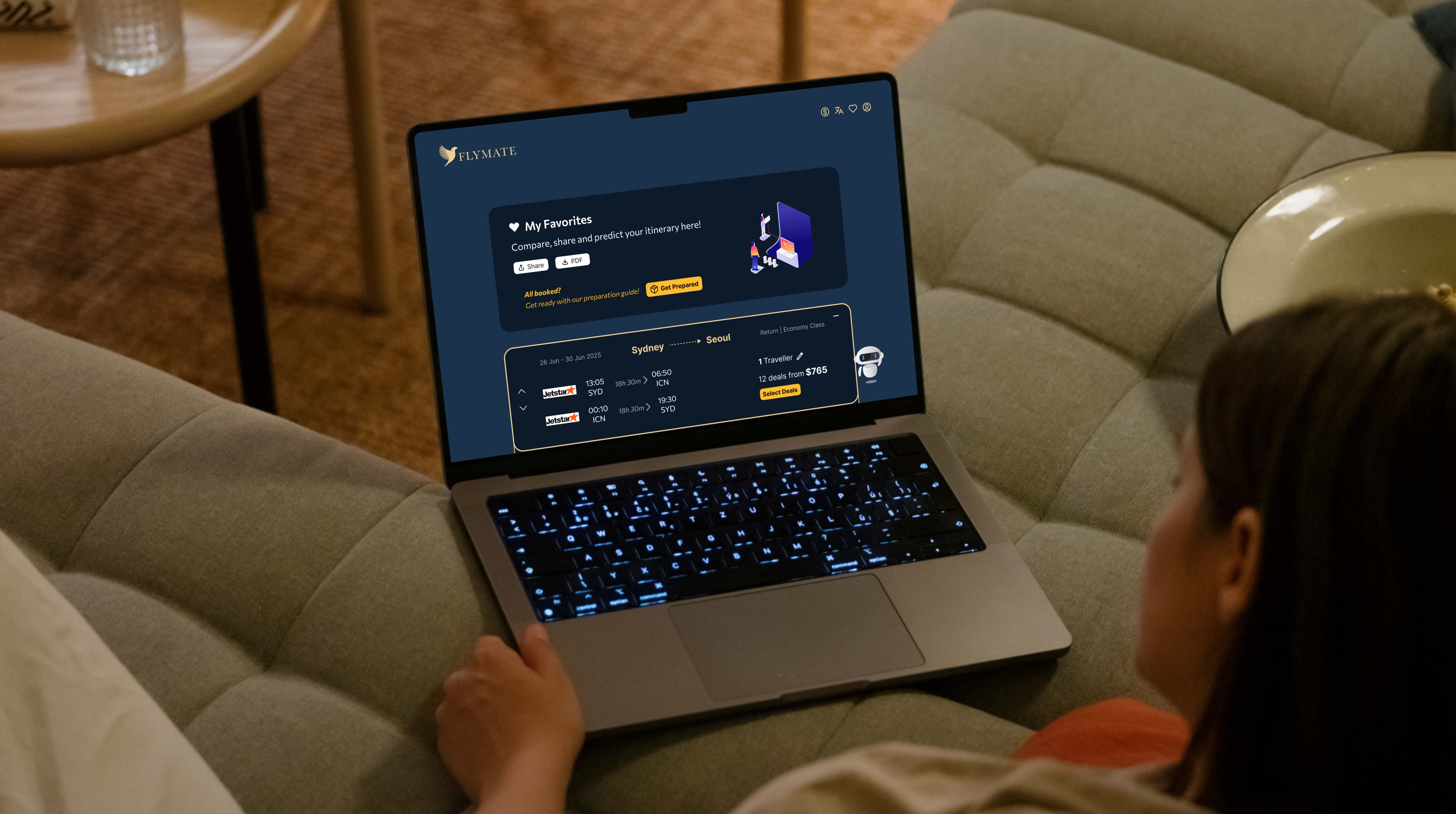
Flymate Website
TRIP PLANNING MADE EASY,
from ai search to prepping.
This was a team project where I designed the website for the first part of the user journey, while my teammate created a mobile app for the second part. In this presentation, I’ll be focusing on the website and my contribution.
PROBLEM SPACE
Research has shown that travelers often experience a fragmented booking process. Most travel websites separate flight and accommodation searches into different pages, forcing users to switch back and forth to complete their bookings. Additionally, when preparing for their trip, users are given little guidance on what to pack or which documents they need. As a result, travelers often rely on scattered and unreliable sources, such as forums and personal blogs, to gather this information.

DESIGN SYSTEM
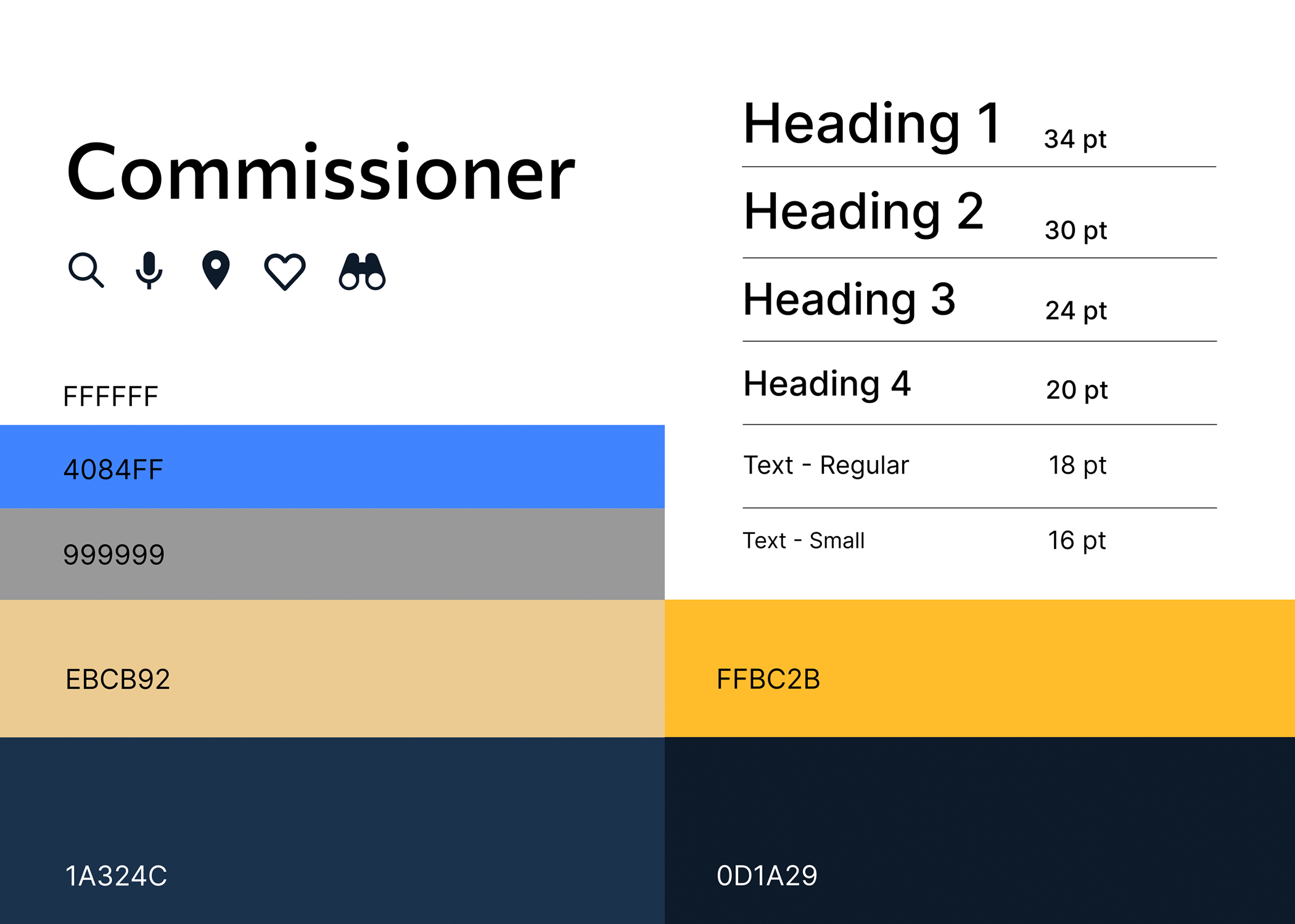
Through research and competitor analysis of flight and travel-related websites, I found that shades of blue are commonly used to convey trust and reliability. To align the Flymate brand with industry standards while establishing a sense of professionalism, I selected Air Force Blue as the primary color. This is complemented by accents of orange and bright cobalt blue to highlight key interactive elements, enhancing visual hierarchy and guiding users intuitively through the interface.

USER RESEARCH
Through broad keyword searches on Reddit and TikTok, my teammate and I found that travellers are mostly concerned with managing anxiety, packing, and being ready for emergencies. Since travel needs vary and unexpected issues often arise, many people feel overwhelmed during this stage of preparation.
We conducted online ethnographic research and used a bottom-up thematic analysis to group the data. First, we processed the content into a set criteria (context, data record, recorded observations, interpretations and theme). The data is then grouped and sorted into broader themes. Finally, we assessed how these issues affected user goals and needs, which informed my design direction.
USER PERSONA
To ensure our designs effectively communicate with our target audience, we developed realistic personas representing two key user groups. Helen represents independent travellers in their 20s to 40s who value a clear and informed journey, while John reflects busy parents who need to multitask while managing family responsibilities.
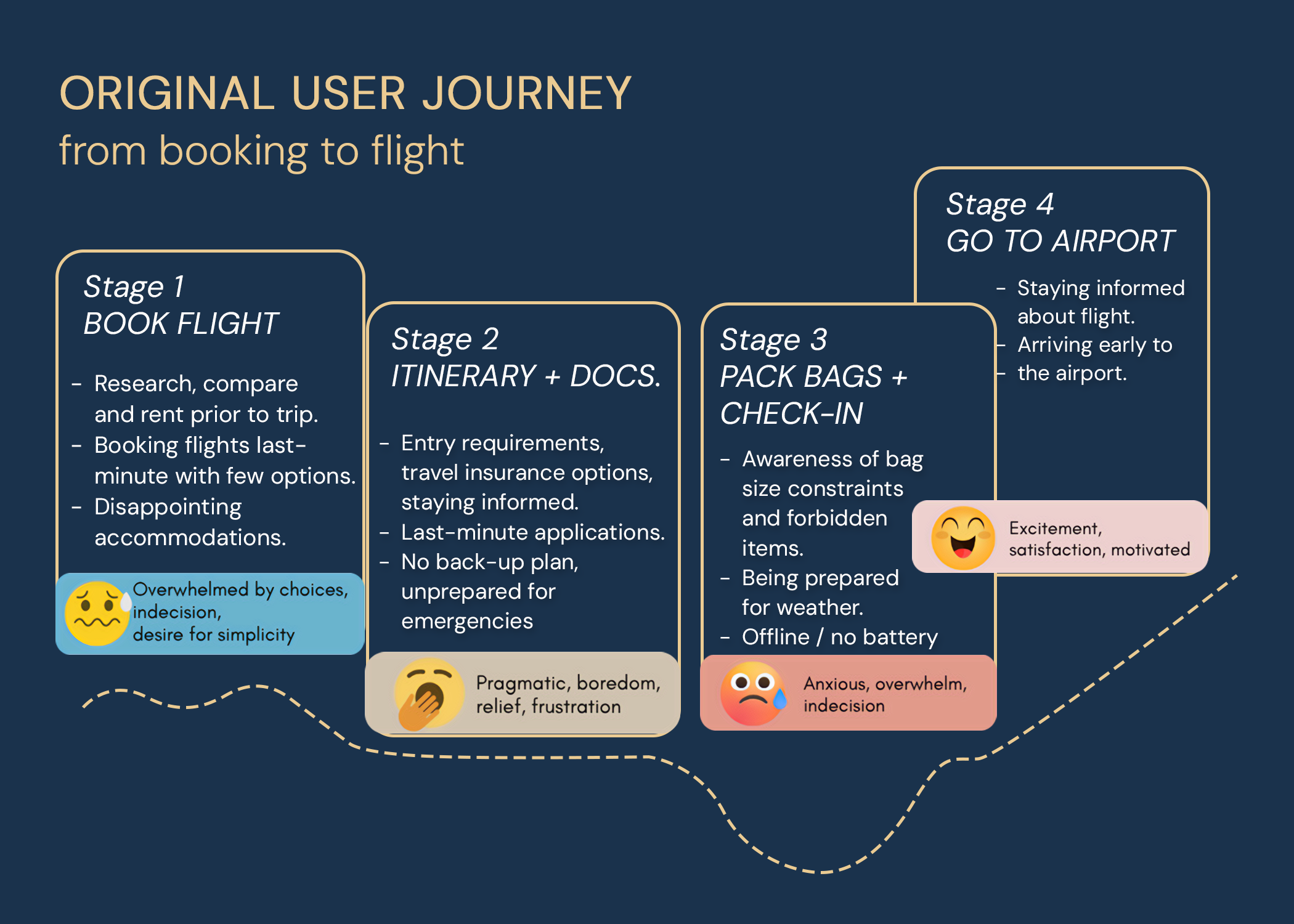
ORIGINAL USER JOURNEY
To uncover design opportunities, I broke the user journey into key stages and mapped out the tasks, issues, and emotions at each point. One major problem area was during packing and baggage check-in, where a lack of clear guidance often leads to stress and last-minute confusion—highlighting opportunities for features like an easy-to-access bag size guide, a personalised packing checklist, and timely online check-in reminders.

COMPETITOR ANALYSIS
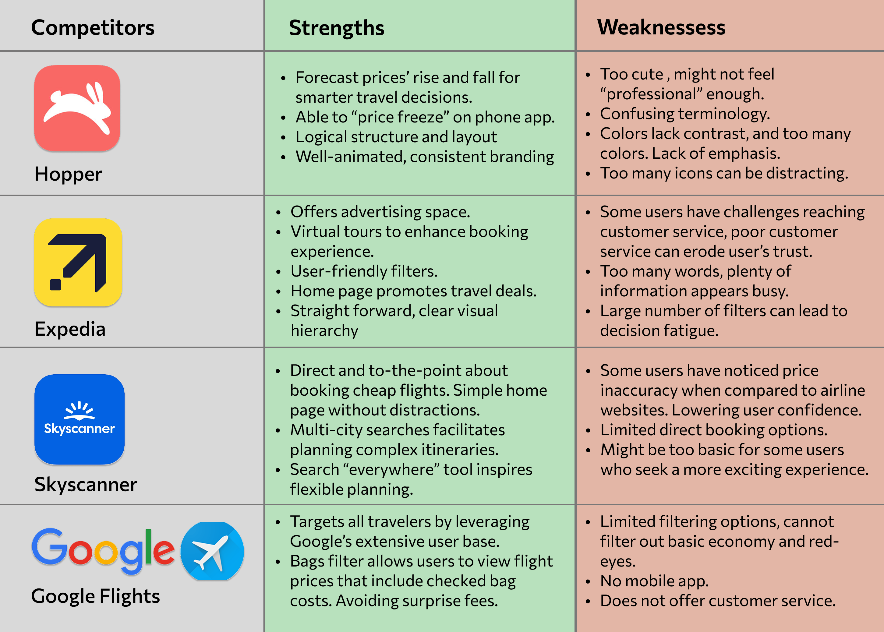
Focusing on the pre-flight journey, I analysed competitors including online travel agencies like Hopper and Expedia, and comparison sites like Skyscanner and Google Flights. They offer booking services across flights, accommodation, and more. I evaluated their strengths and weaknesses across user experience and business factors such as functionality, ease of use, branding, onboarding, and loyalty programs.
Key insights include the importance of maintaining a professional and trustworthy interface, avoiding information overload and excessive redirection, and ensuring feature accessibility across both desktop and mobile platforms.

DESIGN SOLUTION
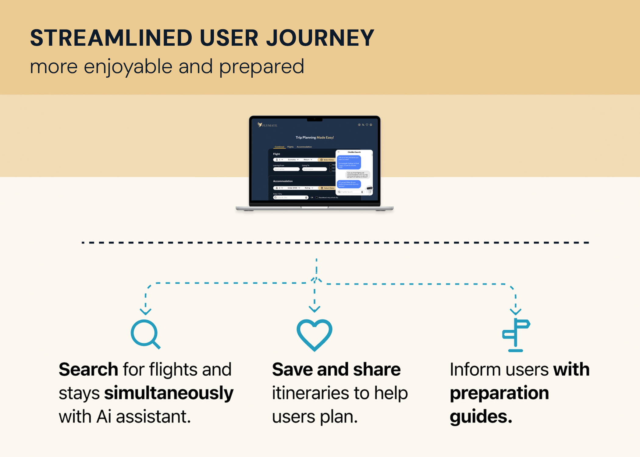
A website that streamlines travel planning by allowing simultaneous flight and accommodation searches. An AI chatbot personalises results without manual input, while a favorites feature helps users organize and shortlist options. A built-in preparation guide ensures travelers don’t miss documents, essentials, or emergency items.
WIREFRAME
FROM HAND SKETCH TO BALSAMIQ
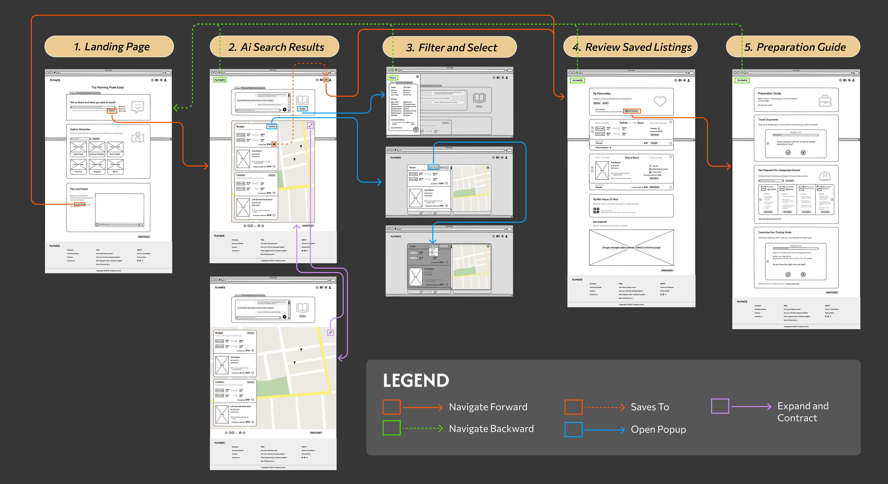
In response to my research, I iterated on wireflows aimed at simplifying trip planning on desktop, helping travellers stay organised with less stress and confusion. Drawing on Müller-Brockmann’s (1981) principles of alignment and grid-based design, I left-aligned content within a centred grid to convey order and professionalism.
1. Landing Page
To streamline itinerary searches, I introduced an AI chat box that finds flights and hotels simultaneously through conversational language, merging two steps into one. This reduces complexity and makes planning less intimidating. I also minimized text, using icons, images, and animation to create a more engaging experience.
2. Ai Search Results Page
Following Nielsen’s (2024) heuristic principle of “flexibility and efficiency of use,” I retained tabs and a type area in the AI search, allowing users to manually search or refine results via chat. Flights and accommodations are grouped into “budget,” “comfort,” and “luxury” packages to streamline choices. The listings are scrollable, while the interactive map stays static and indicates hotel locations on hover.
3. Filter and Select
To support user’s “primary goals” (Nielsen, 2024), the filter button reveals all flight and accommodation preferences in a slide-in popup. This keeps the interface clean, letting users focus on listings without distraction.To maintain context and reduce disorientation, “budget” listing results open in an on-page popup instead of navigating to a separate results page.
4. Review Saved Listings
This page helps users review and organize their saved listings for itinerary planning, especially for multi-city trips. Listings emphasize destinations at the center for easy identification, with controls to rearrange (left) or remove (right) items.The lower half of the page prompts users to download our app and suggests additional itineraries to inspire more travel.
5. Preparation Guide
To address pain points like last-minute document prep and packing stress identified in our ethnographic research, I focused on the emotional journey—feelings of boredom, overwhelm, and pragmatism. I gamified the process with fun quizzes that inform users of their needs, which then send them a summary via email.
HEURISTIC EVALUATION
FROM WIREFRAME TO HI-FIDELITY PROTOTYPE
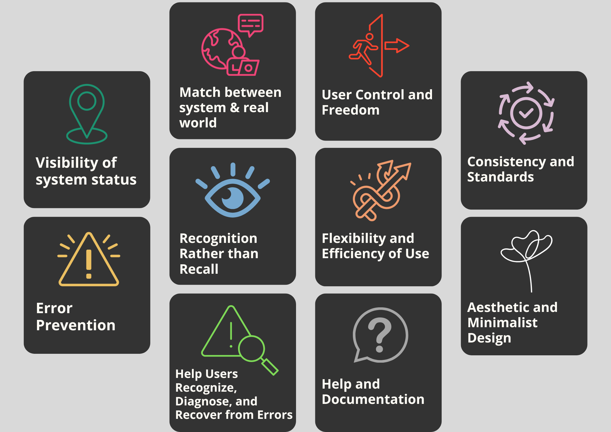
A heuristic evaluation was conducted to assess the website design, using Jakob Nielsen’s 10 usability principles (Nielsen, 2024).
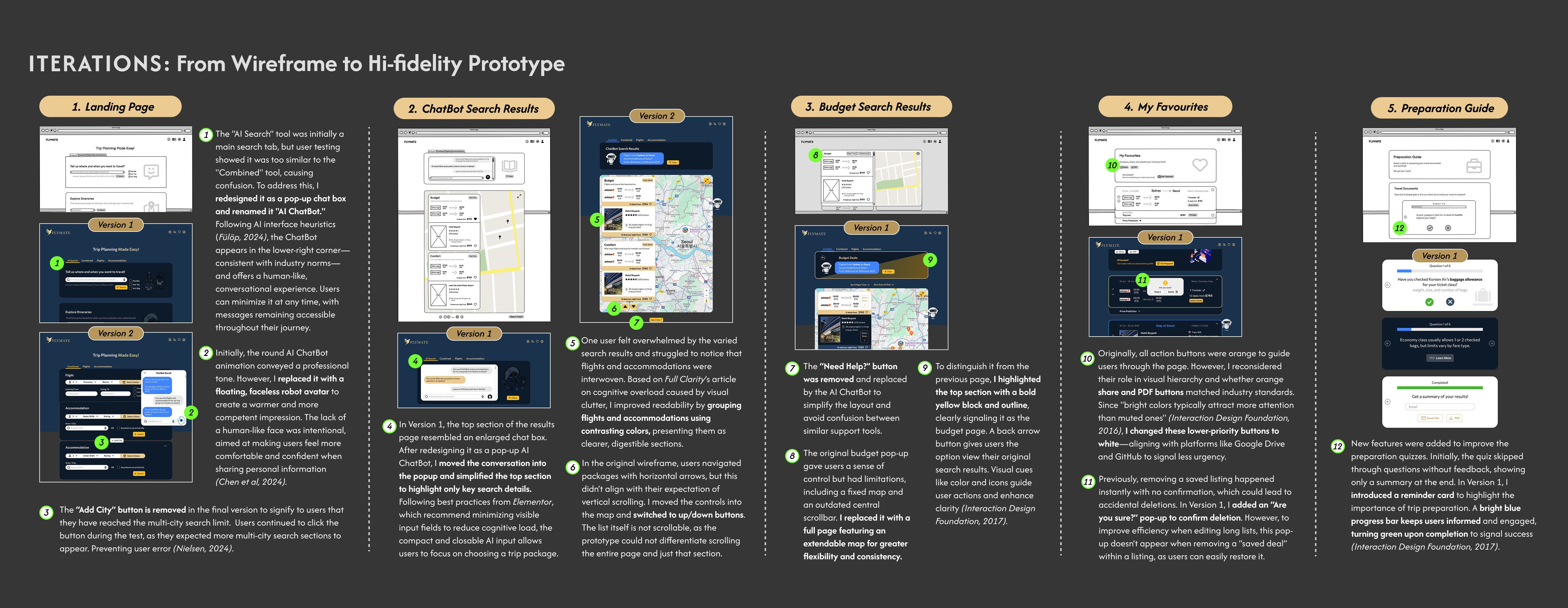
User testing highlighted key strengths, including clear system status through colours and animations, consistent layout and styling, intuitive placement of buttons, and a sticky navigation bar that helps users stay in control. However, several issues were identified: the AI search tab caused confusion it looked similar to other tabs, the landing page lacked filters for package deals, the “Add City” button remained active after reaching the multi-city limit, and there was no error prevention when users removed saved listings. These insights informed design iterations to improve usability.
HIGH FIDELITY PROTOTYPE
An engaging website that streamlines trip planning with Ai search and preparation guides.
KEY FEATURES
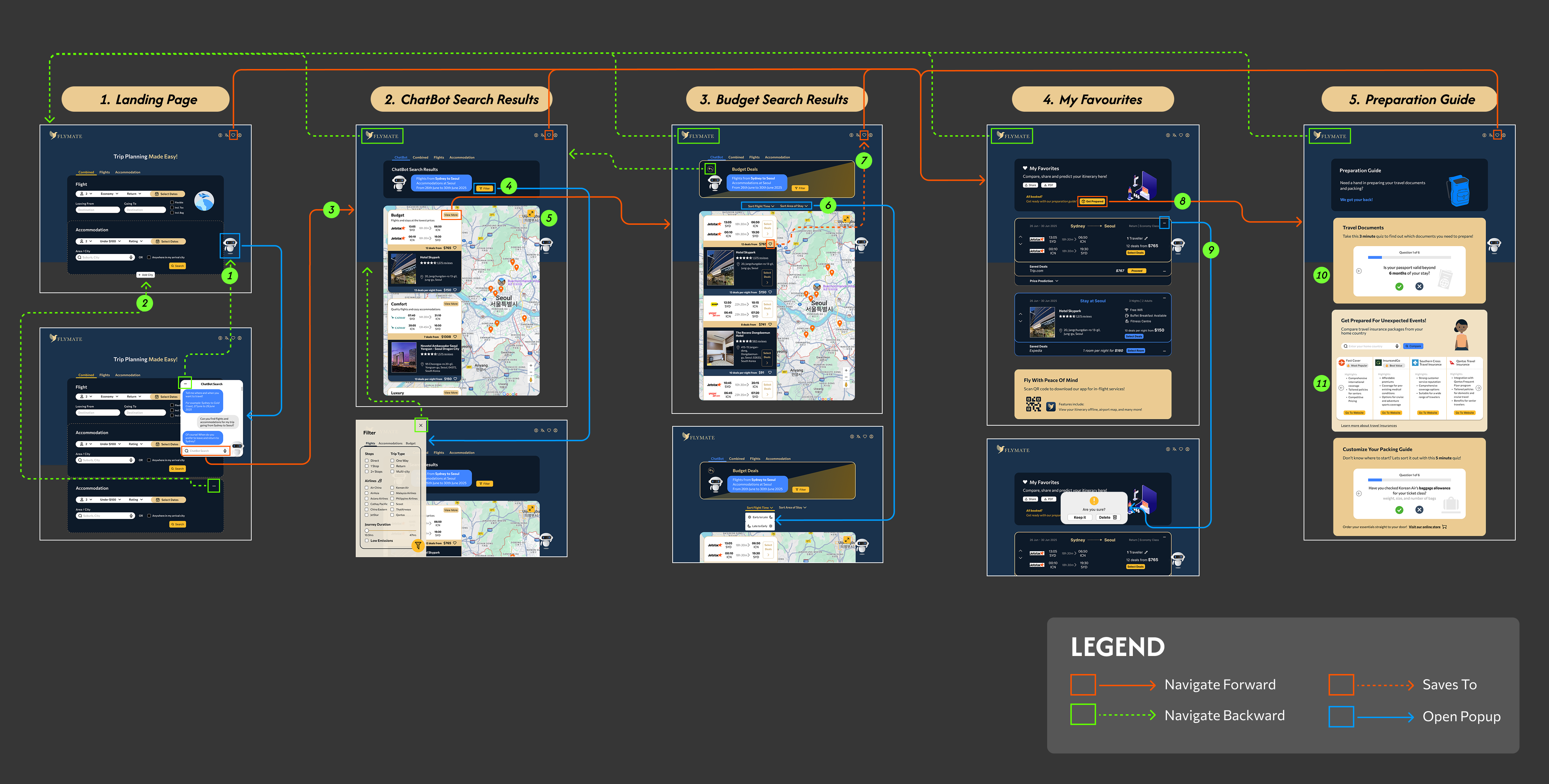
1. Ai chatbot popup opens up once user enters the landing page. The animated icon draws attention and keeps users engaged on the website for longer (Anzal, 2025). Pressing Enter in the Ai ChatBot lead to the ChatBot Search Results page. A new tab appears on the top to confirm key search details. Supporting recognition over recall.
2. Expandable map lets users view a wider area when searching for hotels, improving efficiency and convenience. By default, it stays contracted to maintain layout consistency.
Listings layered on the map are colour coded, with flights shown in white and accommodation in navy, making it easier to distinguish between categories and helping users shortlist options with less cognitive load (Rose, 2025).
3. Preparation quizzes are made engaging to prevent forgotten documents or items. Quiz questions have no back button, prompting users to complete the quiz. If they do not have the required item, a reminder cards shows up with exit buttons allowing users the freedom to close it. A bright blue progress bar keeps users informed, turning green upon completion to signal success.

